
I’m not one of those artistic types, who seem to instinctively daub the right pigment around for realistic effect. Red/green colour blindness doesn’t help, but mainly I just don’t seem to have any empathy in this regard.
So how to work around these modelling inadequacies…?
Basically what I’m looking for is a method to define which paints to use for any particular project. This isn’t too difficult for rolling stock and the like, but rather more tricky for scenic areas.
What I have come up with is a fairly mindless technical solution that works very well. It’s based on photographs and their digital analysis, so there are the normal disclaimers about photo quality, lighting, screen/printer calibration and so on. However, provided the source material and equipment is reasonable the results are far, far better that playing pick and mix from the Humbrol stand.
Essentially what I do is analyse photos for colour and then use online resources to match to available paints.
The current project is rock faces at Rewanui. A field trip reveals that freshly exposed rock in the area is a pale cream, but this is weathered to mid grey on average and a very diverse range of shades in detail. The goal here though is to find a range of shades for base painting – the detail colouring will come out in later weathering.
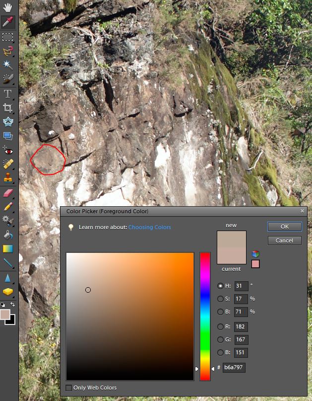
In the example above I have opened an image of the rock in Photoshop (but any photo manipulation software will do). Using the eyedropper tool I’ve chosen a colour from within the red circle. The colour data is described in the numbers at lower right. I use the RGB (Red-Green-Blue) numbers as I find them intuative and also the hex code (b6a797) which is the same data in base16. This isn’t at all intuative, but it is easier to cut and paste between websites and documents.
At this point we already have a colour swatch (under ‘new’) that we can cut and paste (I use the Windows Snipping Tool) into a reference document.
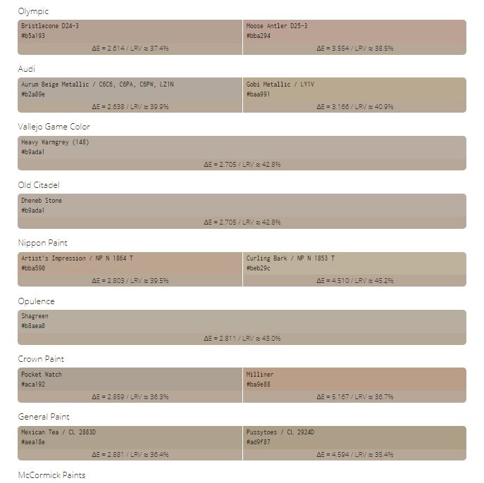
But what I do is to copy the hex value and paste it into the search bar at https://encycolorpedia.com and hit ‘search’.

This generates a bunch of information that is largely irrelevant (The 25% lighter/darker information is handy if you are going to paint in highlights and shadows) to this exercise at the top of the page, but scroll down a little and you reach a section titled ‘similar paints’. If anything this is rather too extensive for us, but many model paints are listed together with car paints and domestic brands. This is rather handy as it allows a matching colour to be obtained from Resene test pots, car paint aerosol or your model paint of choice. Close matches are at the top of the page, but all listings are generally much better than I’d achieve by intuition. Sometimes there will be no close match for your favoured brand – which is reasonable.
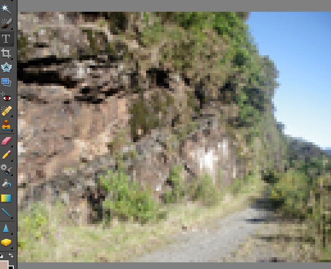
One caution with this technique is that the colour picker is looking at one pixel at a time, so for natural subjects there is often a lot of variation over a tiny area. A good way to get over this is to pixelate the image (in the example below I downsized by 2% and zoomed in). It is now much easier to see which block of colour I’m selecting and how representative of the whole it is. Another advantage of this technique is that it is assessing colour from a similar perspective to that we view the models from. Which is exactly the colour I need.
For scenic work I am after a range of shades. I’m using Vallejo paints at present so I dropped the information into a table containing the RGB data, Paint information, the colour swatch from the photo and the colour swatch for the paint.
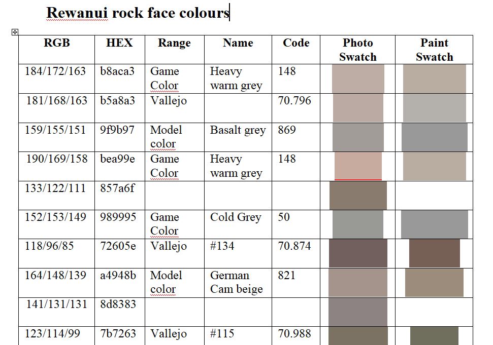
There are always interesting results for me in these exercises. Very often the colours that drop out are a surprise, but they do work on the models.
The Rewanui rocks weather to a fairly neutral grey (if the RGB values are all close there is no colour), but generally the rock tends orange/brown. To paint the rock faces I’ll likely go with Heavy warm grey and German camouflage beige. The darker brown is the Vallejo equivalent to Humbrol’s Dark Earth and there will be some Mid neutral greys in there as well. It is apparent that most of these shades are darker or lighter shades of the same base colour – albeit with some variation.
The next job, after popping down to Acorn Models for supplies, will be to get some paint onto the model…